


Estimated reading time: 12 minutes ☕☕☕
To determine the quality of your product, and if you have a good product/market fit, one of the best metrics you can use is:
Are people paying for it?
With this tutorial, we'll give you a full guide to getting started with tracking your sales and revenue through PostHog, so you can:
- Determine sales KPIs
- Understand who your paying customers are
- Analyze your revenue and its main sources
- Track conversion and retention across subscription plans
Prerequisites
To follow this tutorial along, you need to:
- Have deployed PostHog.
- Have started receiving events via our snippet, one of our integrations, or our API.
Note: For sending events with revenue data, we recommend you integrate PostHog in your backend, given that, by nature, client-side code can be modified by the user.
Setting up events to track revenue
The first thing you need to do to start tracking revenue and sales is set up events that trigger when a relevant operation occurs.
Essentially, when a sale operation completes successfully, you want to capture a PostHog event with the useful information from that sale.
For example:
In the example above, _sale_completed would be called after your existing logic for purchases determines a sale has been successfully completed. An event will then be sent to PostHog with the information you want to include about the sale, such as the plan, the price, the currency, and anything else you may find relevant.
Note: The most important thing here is to ensure you only send the event to PostHog when you are sure a sale completed. This ensures your tracking data matches your actual revenue, preventing an event from being captured for a sale that later gets cancelled.
Visualizing your revenue over time
Having started to send events that track sales to PostHog, the first thing to do is visualize your revenue over time. This can be done in 'Trends', and might look something like this:
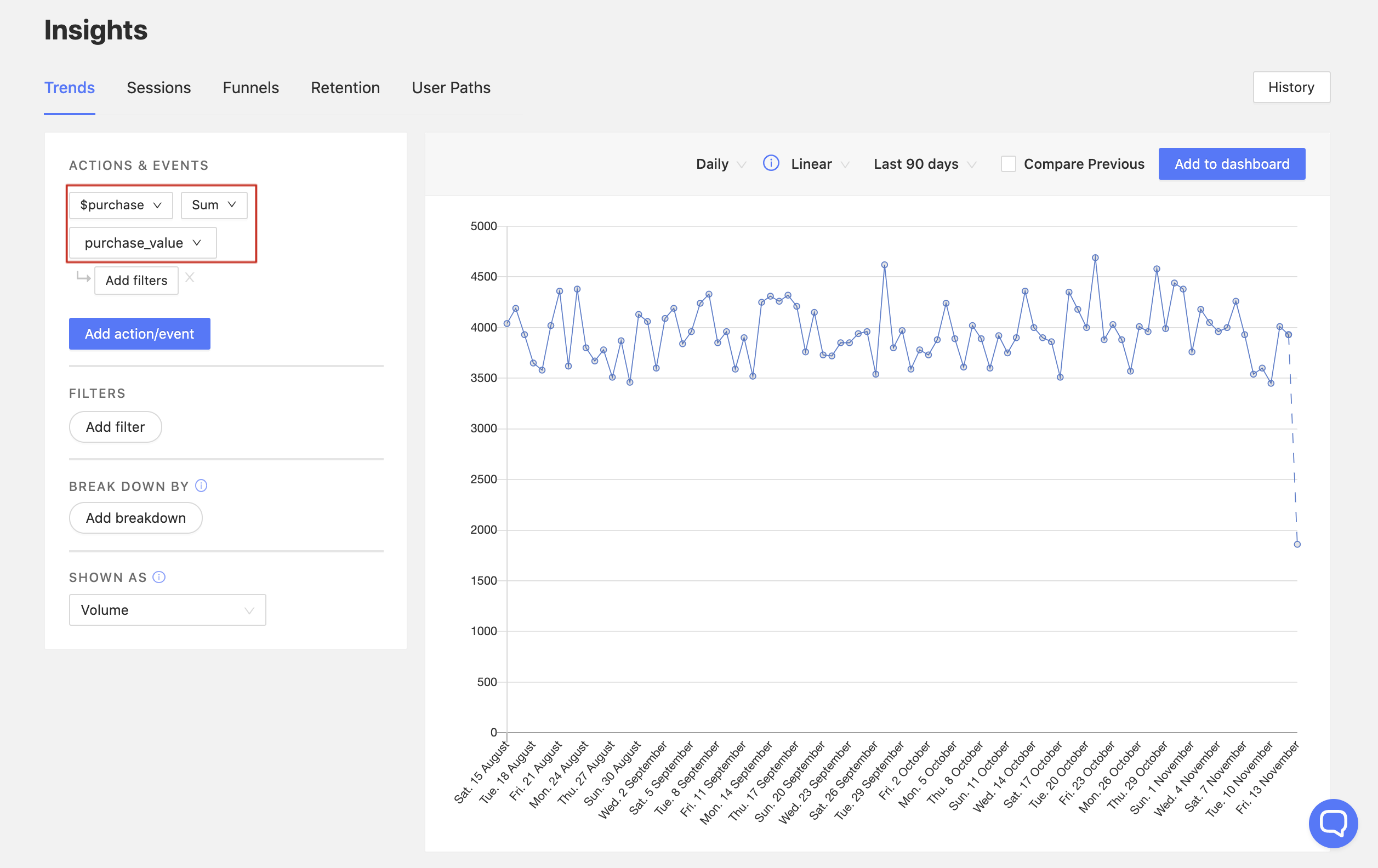
The chart above is targeting a $purchase event over the time period of "Last 90 days". However, instead of tracking the total volume of the event, it is tracking a sum of the value of one of its properties, called purchase_value.
The way you can achieve this view is by clicking on the dropdown to the right of the property name, which is set to Total volume by default. Once selected, this will reveal the following options:
- Total volume
- Active users
- Sum
- Average
- Maximum
- Minimum
The first two options target the event itself, showing either the volume of events or the number of active users who triggered the event.
However, the last four options target numerical properties on events. When tracking revenue, this allows you to visualize:
- The total revenue per time period (e.g. by hour, day, or month)
- The largest (and smallest) purchase per time period
- The average purchase value per time period
Here are is an example dashboard combining charts that use all four of the numerical operations:
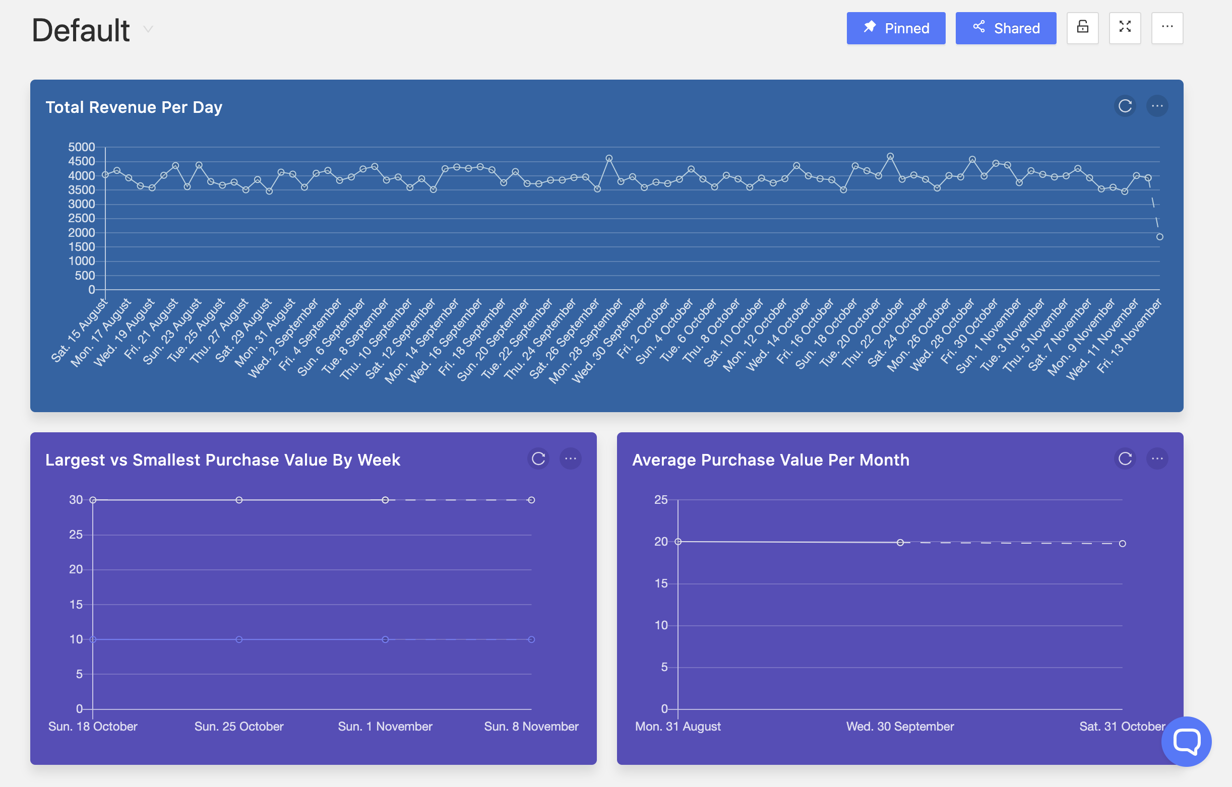
Total revenue in the last month
If you want to see aggregate values for periods, you can change the time frame on line charts, or you can also display data as a table or pie chart, which combines the aggregate values of the periods and displays it as one value.
To see the total revenue of the previous month, for instance, you can set your time frame to 'Previous Month' and your chart type to 'Pie'. You can pair this with a view of this month's total month-to-date revenue, as well as compare performance on a week-by-week basis.
Here's what a dashboard with these views might look like:
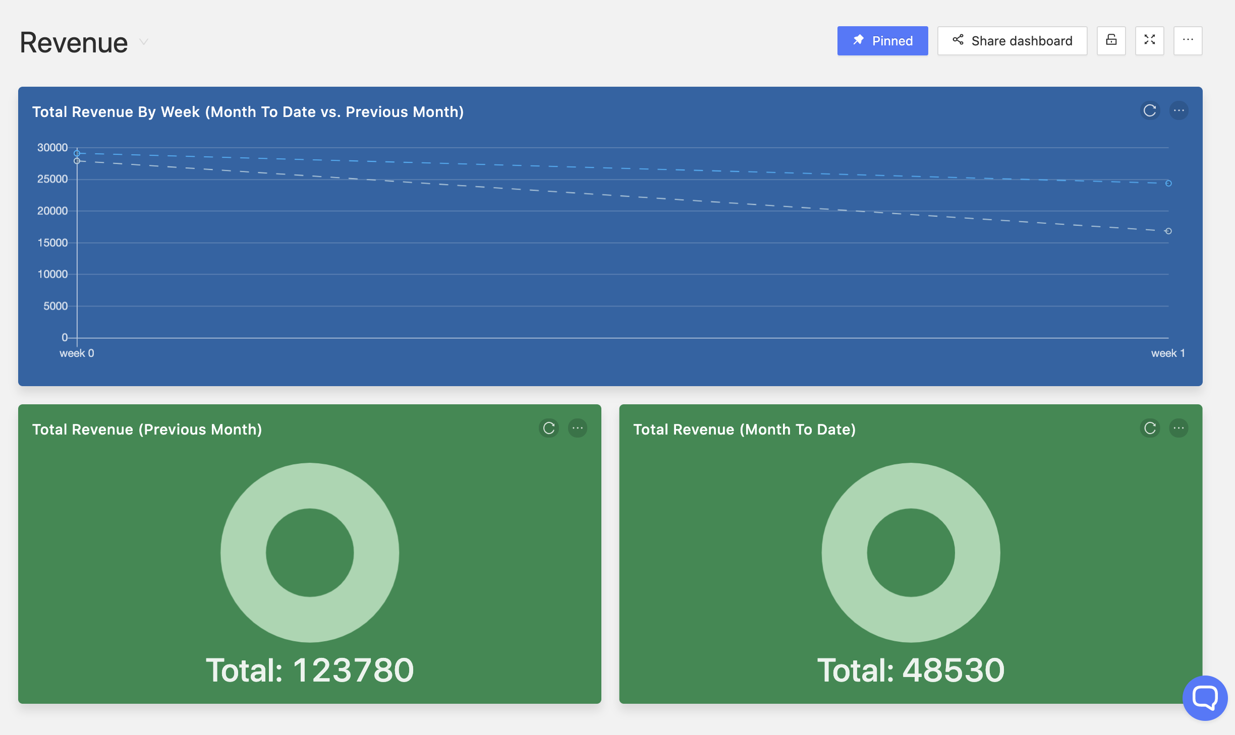
Note: With a view like this, you can then fire up your ad platform of choice to work out your ROIs, or better yet, build an app to automate this.
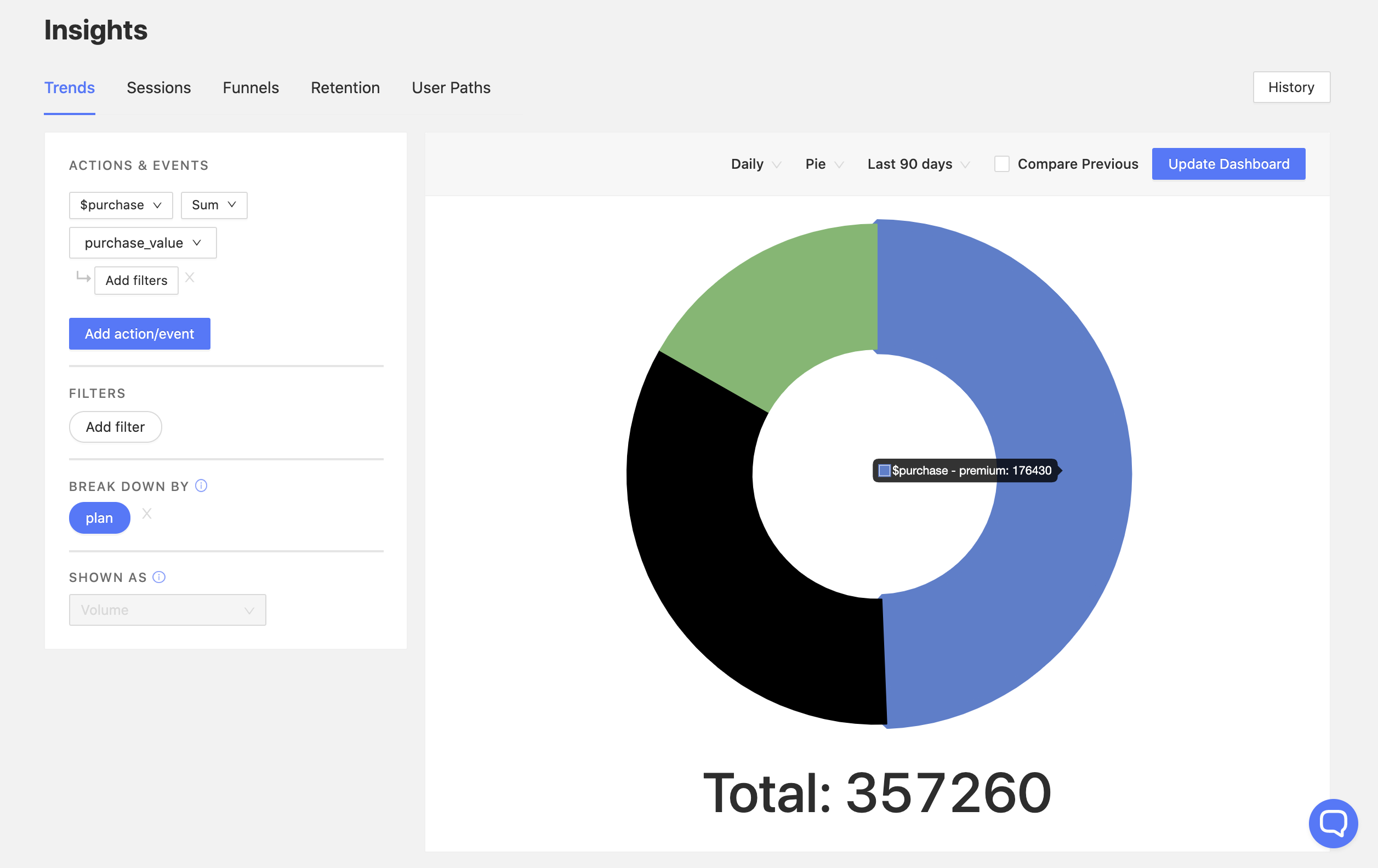
Breaking down revenue by source
Another important metric is determining the contribution of each revenue source to your total revenue.
You can visualize this by using our 'Break Down By' feature.
For example, for a company with the following pricing structure:
| Plan Name | Price |
|---|---|
| Basic | 10 |
| Growth | 20 |
| Premium | 30 |
We can break down revenue by the property plan and see how each plan is performing:
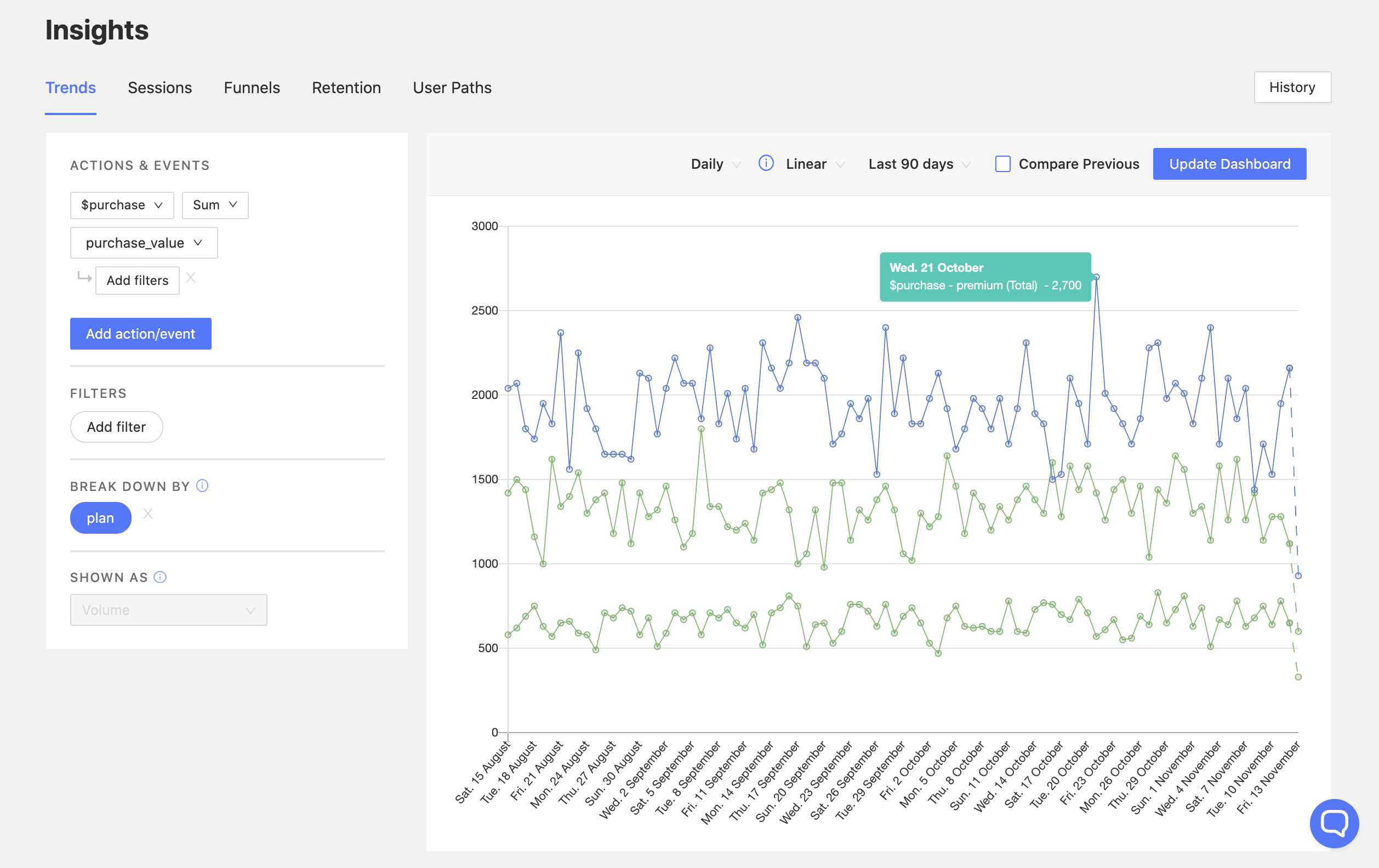
If, rather than plans, your company has different revenue sources altogether, you could, for instance, substitute the plan property for source. This would allow you to have the same view, broken down by source, such as in_app or desktop.
This can also be visualized as a pie, in order to see more clearly the actual contribution of a plan to TR:
Note: If you have revenue data in various currencies, or simply want to convert your values to another currency, you can use our Currency Normalizer app to do so.
Conversion funnels
When tracking revenue, there are various useful conversion metrics to explore. Here are some examples:
What percentage of my paid users pick 'Plan X'?
One of the simplest metrics you can start with when using PostHog funnels is determining what plans are most popular.
To do so, you can set up a funnel with the following two events:
purchaseevent or equivalentpurchaseevent or equivalent filtered byplan equals 'X'or equivalent properties
This gives you the following view:
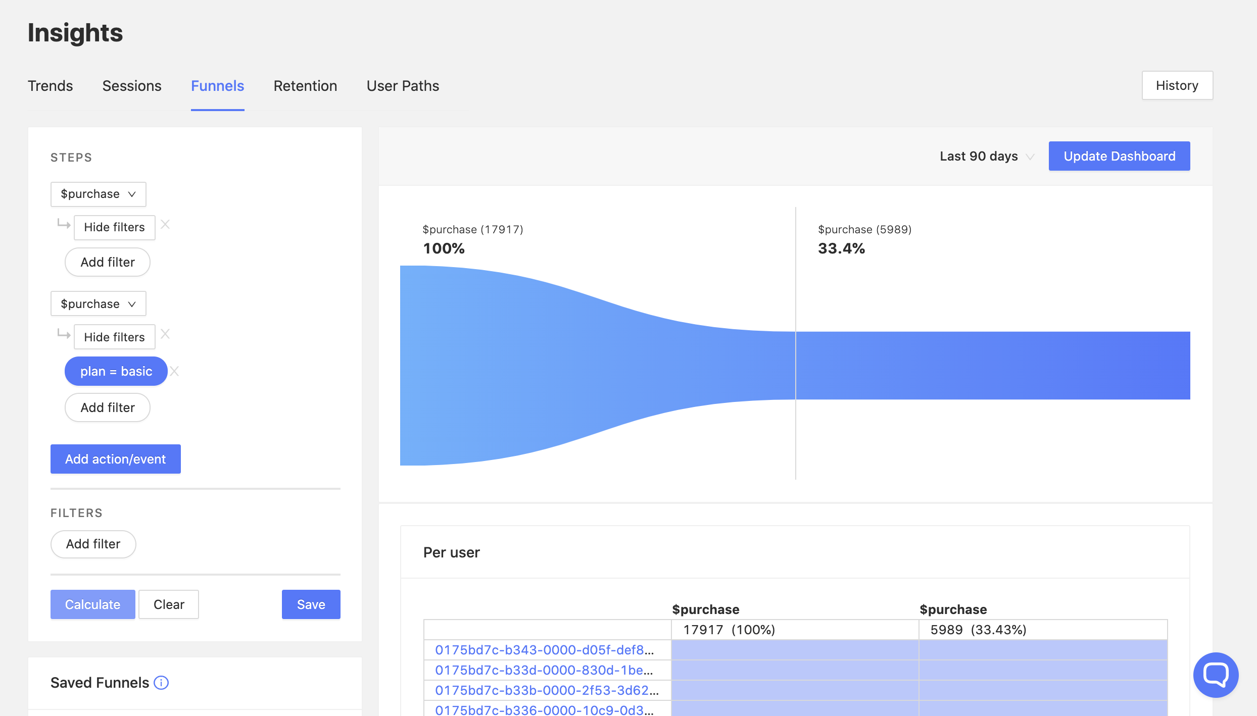
The funnel above shows us that, out of all unique users who paid for a plan (had a $purchase event), 33.4% pick plan basic.
Measuring conversion to paid plans
Let's answer the following two questions with funnels:
- What percentage of my total users convert to a paid plan?
- What percentage of my free trial users convert to a paid plan?
Here's an example dashboard that answers these questions:
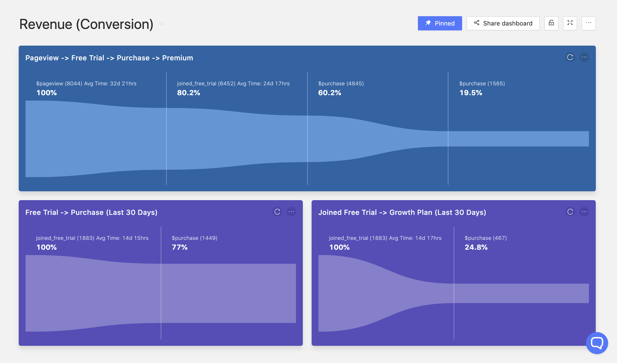
Pageview -> Free trial -> Purchase -> Premium plan
The top funnel in blue shows us the journey of our users from pageview to upgrading to a premium plan. It was created with the following steps:
- PostHog's
$pageviewevent - A
joined_free_trialevent - A
$purchaseevent - A
$purchaseevent filtered byplan equals 'premium'
From this funnel we can establish that:
- ~80% of the users that visited our website got a free trial
- ~60% of the total users made a purchase
- ~20% of our users purchased the premium plan
Free trial -> Purchase
This funnel in purple on the bottom left was created from some of the same steps as the main funnel, but it is more concise. It targets:
- A
joined_free_trialevent - A
$purchaseevent
From it, we can determine that 77% of our free trial users from the last 30 days signed up for a paid plan, which is a great conversion rate.
Free trial -> Growth plan
Lastly, this funnel is the most specific out of the three, giving us the conversion from the free trial to a specific plan. It was built as follows:
- A
joined_free_trialevent - A
$purchaseevent filtered byplan equals 'growth'
It shows us that in the last 30 days, ~25% of our users who had a free trial signed up for a growth plan afterwards.
Measuring retention per subscription plan
Having users pay you for your product is great, however, if you have a subscription plan, it is just as important to keep a customer as it is to acquire a customer.
For this, we need to calculate retention. This can be done either on purchases as a whole, to see if your users consistently keep a subscription, or filtered by plan, to see if users consistently keep the same subscription. The latter is particularly relevant for your top plans, since users can't upgrade, so you want to make sure they don't downgrade.
Here's an example of a monthly retention table (recurring) for a specific plan:
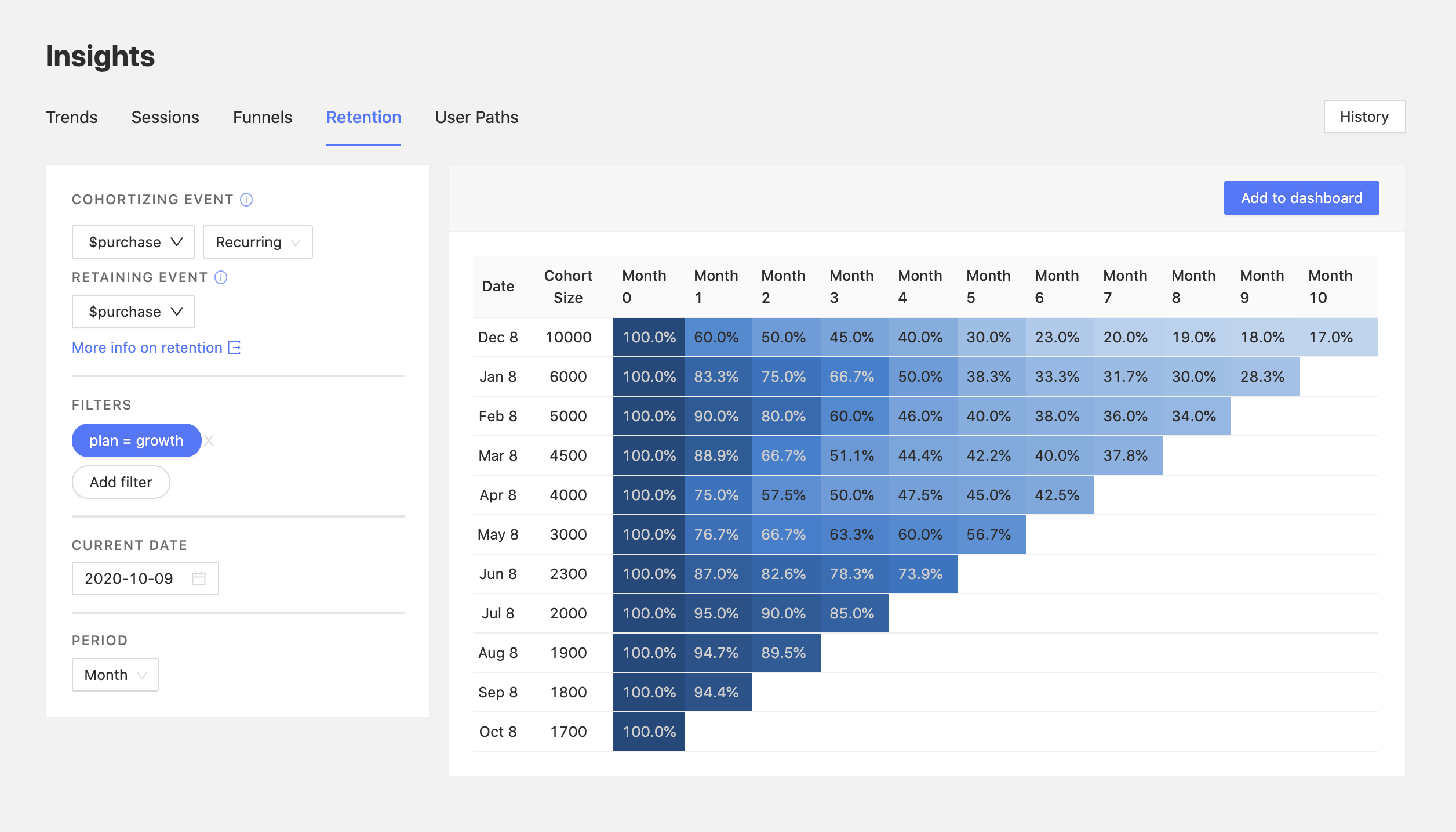
Here we can see the retention on the 'Growth' plan, which appears to be improving over time.
While only 17% of the users from the previous December have continued with the subscription until now, the retention from Month 0 to Month 1 improved from 60% in December to over 90% across the past 3 months, indicating a positive trend.
This retention view also pairs well with funnels, so that when you determine that your retention for a plan is poor, you can find out where those users are going. Are they cancelling their subscription? Are they downgrading?
To test for this, you could create a funnel starting with a subscription to a specific plan, and ending with a cancel_subscription event, or equivalent, in order to determine the percentage of users out of those that churned from a plan who churned from your platform altogether.
Note: If you are tracking subscriptions, make sure to send a PostHog event at every billing event, rather than simply one purchase event upfront. Following the same principle, you can set the
cancel_subscriptionevent when a subscription has been successfully cancelled, in order to track churn more accurately.
Correlate revenue data with usage data
This tutorial provides a good foundation for you to start tracking your revenue and understanding the underlying data better.
However, you can have great insights from correlating revenue data with your overall usage data, such as determining how the number of errors thrown affects your revenue, as well as how different features impact your subscription numbers and retention.
Tracking revenue is just the start.